My role
Product Strategy & Discovery
Facilitated Design Sprints
Led collaborative design sprints to explore opportunities, align stakeholders, and shape solutions.
Shaped Product Direction
Mapped customer journeys to identify pain points and opportunities that informed product strategy.
Design Systems & Product Experience
Established the Design Language System
Partnered with engineering to build the mobile web design system from the ground up, establishing reusable components and interaction patterns.
Owned End-to-End Product Design
Designed end-to-end product experiences, translating customer needs and requirements into intuitive interfaces.
Prototyping & Validation
Brought Ideas to Life
Created high-fidelity prototypes to explore concepts, test interactions, and gather customer feedback.
Led UX Research Collaborations
Partnered with Customer Insights and external research vendors to conduct research and validate design decisions.
About
HOOQ was a video-on-demand streaming platform operating primarily across Southeast Asia and India. In 2018, one of its key differentiators was its diverse content library, offering a mix of popular Hollywood titles and locally produced content tailored to regional audiences.
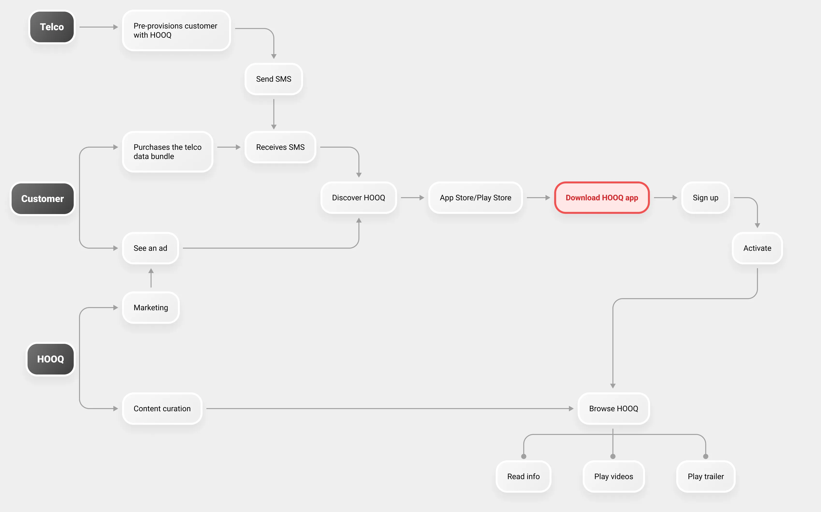
Backed by one of Southeast Asia's largest telecommunications groups, HOOQ leveraged its telco partnerships as a key customer acquisition channel. One of its primary strategies was to bundle HOOQ subscriptions with prepaid mobile data purchases, giving customers an added incentive to try the platform while expanding its reach through the telco's existing subscriber base.
Problem
People problem
“I want an easy and convenient way to discover and watch great video content, from popular Hollywood titles to stories produced locally.”
Business problem
Fewer than 1% of pre-provisioned customers were converting into active subscribers. Our activation journey relied primarily on a mobile app, supported by a static desktop website, limiting the ways customers could discover, access, and activate their subscriptions.
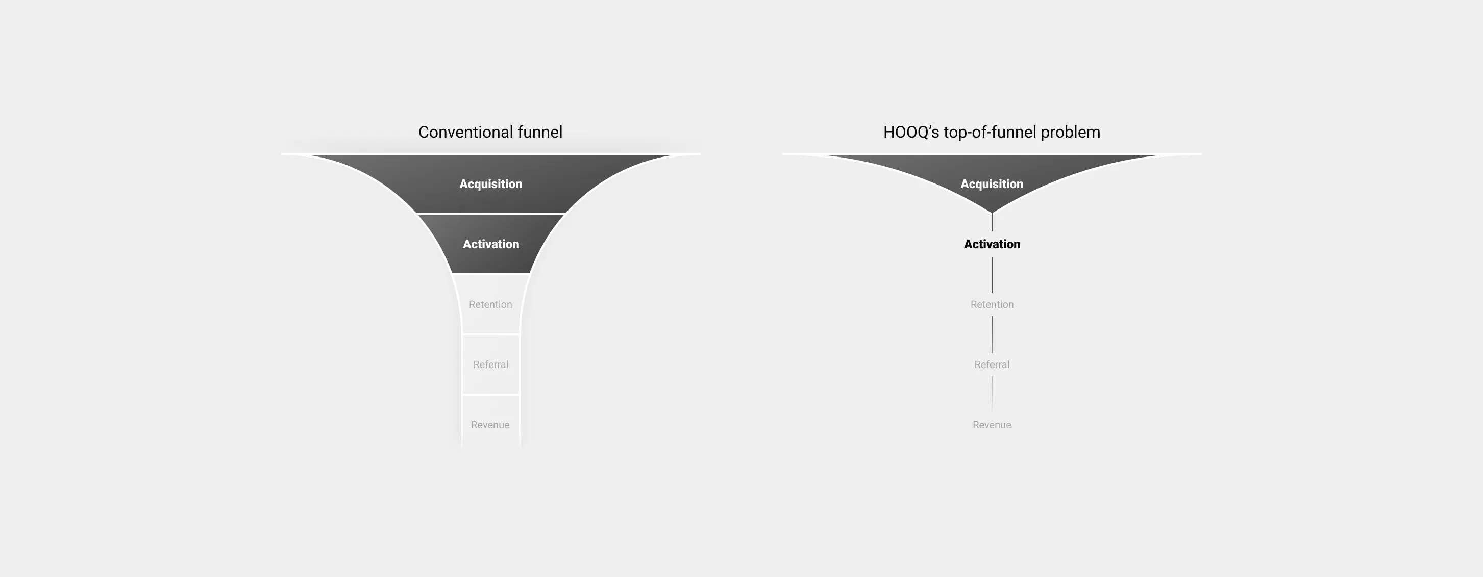
Why aren’t more customers activating their free trial?
How might we measure ground truth of actual page landing to conversions?
Customer profile
Emerging market customers
The majority of our customer base was from Indonesia. They consumed a lot of video content on their mobile devices.
Mobile data usage sensitive
These users were very cautious with their mobile data. A key value proposition for them was data bundles with a separate video data limit.
Best bang for buck
Subscriptions were bundled with prepaid data packs, so HOOQ was seen as a value-added service when purchasing data bundles.
Cost-effective devices
Our current data showed most of our customers were on more affordable Xiaomi phones on Android.
Design sprint
I facilitated a cross-functional Design Sprint to build a shared understanding of our business ecosystem and identify key opportunities. The workshop brought together stakeholders from Engineering, Marketing, Product Management, Data Science, and executive leadership.
Through Lightning Talks, problem mapping, How Might We questions, solution sketching, and dot voting, we aligned on key challenges and explored potential solutions.
Hypothesis
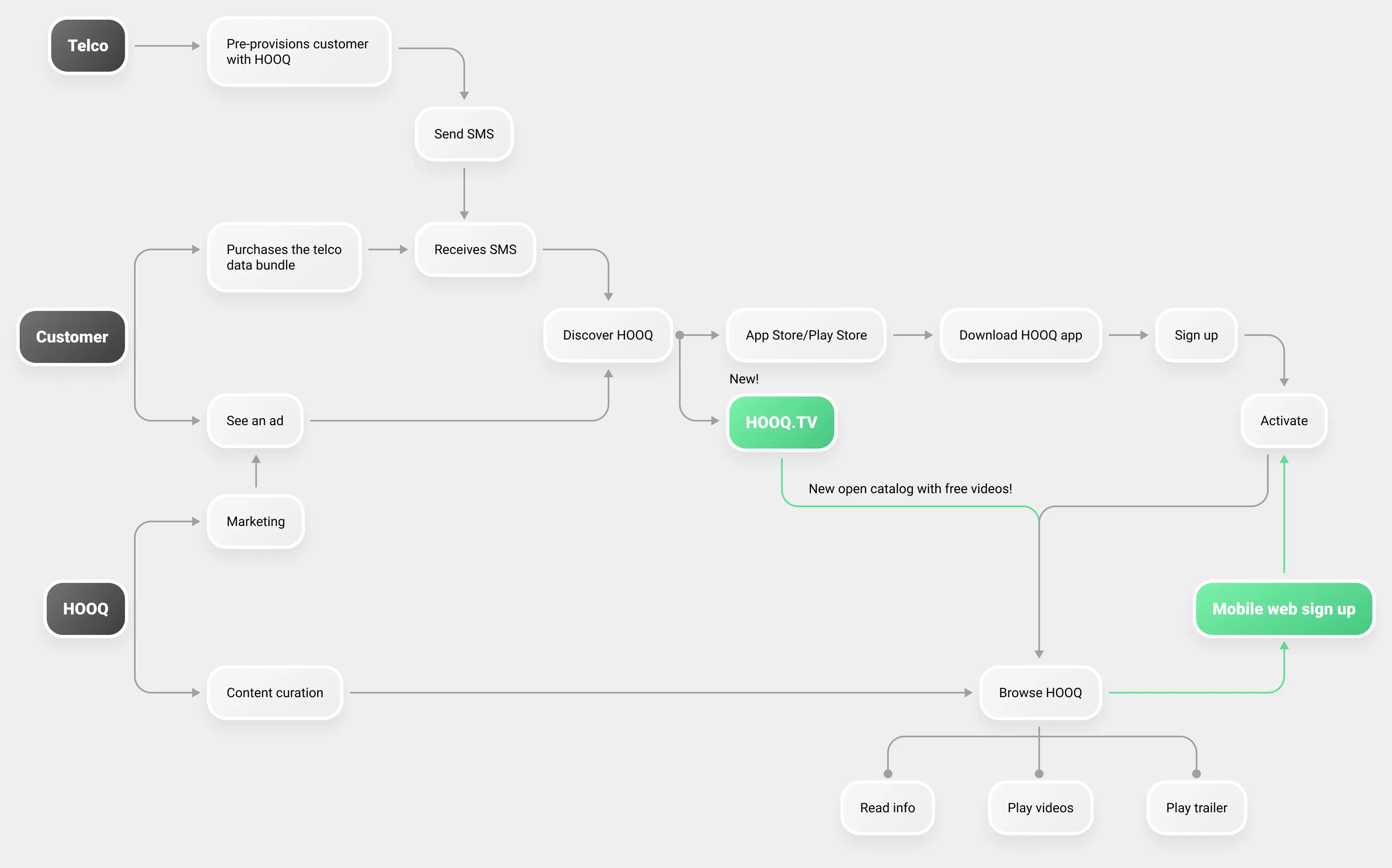
We believed that introducing a web-based experience would reduce friction in the activation journey and improve conversion across both telco partnerships and organic acquisition channels.
To validate this, we defined two key success metrics:
Pre-provisioned Activations
Track the end-to-end conversion from mobile web landing to sign-up and subscription activation.
Streaming Minutes
Measure engagement by tracking the total time users spend streaming content on the platform.
Design foundations
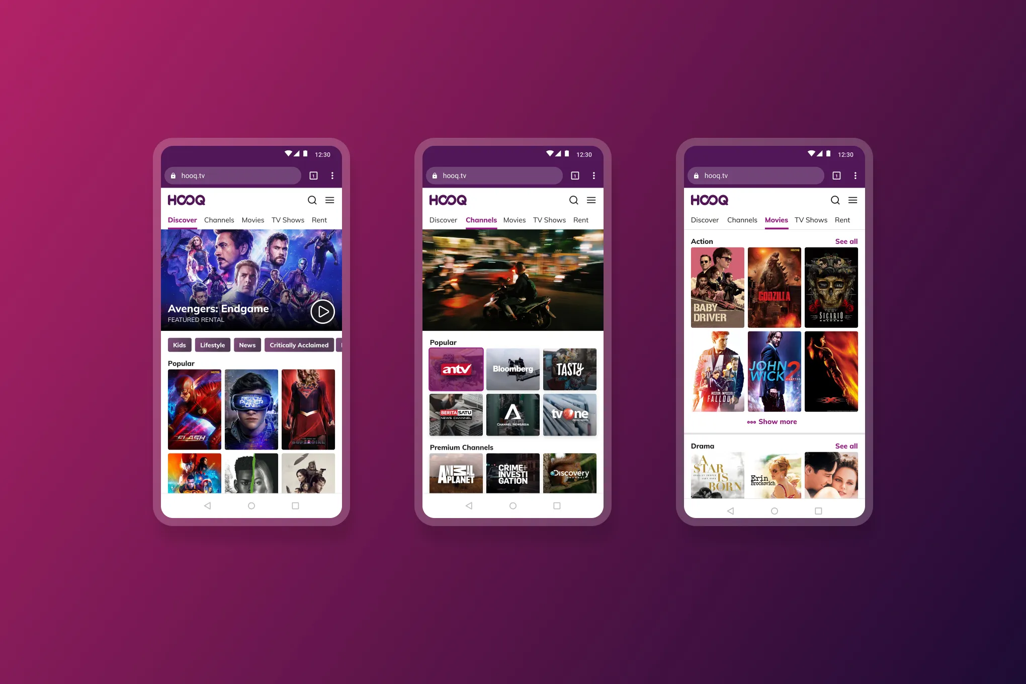
I worked closely with software engineers to shape HOOQ's mobile web Design Language System. While we already had an established desktop website, its design foundations weren't built to scale to mobile. This meant creating many of the core elements from the ground up, including foundational styles, reusable components, and interaction patterns.
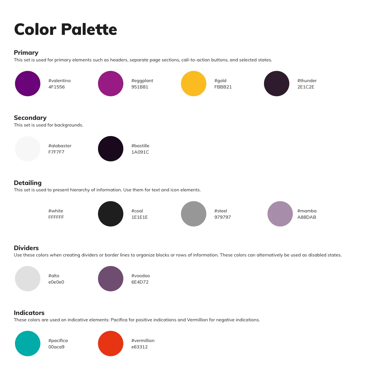
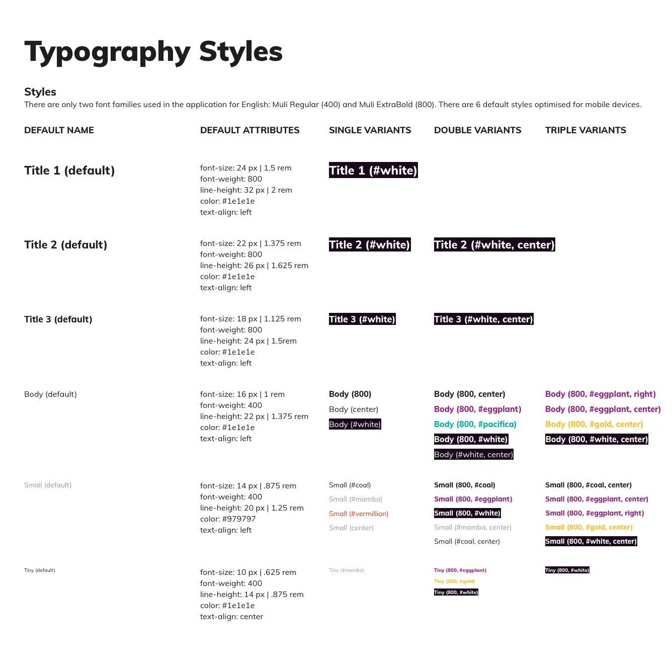
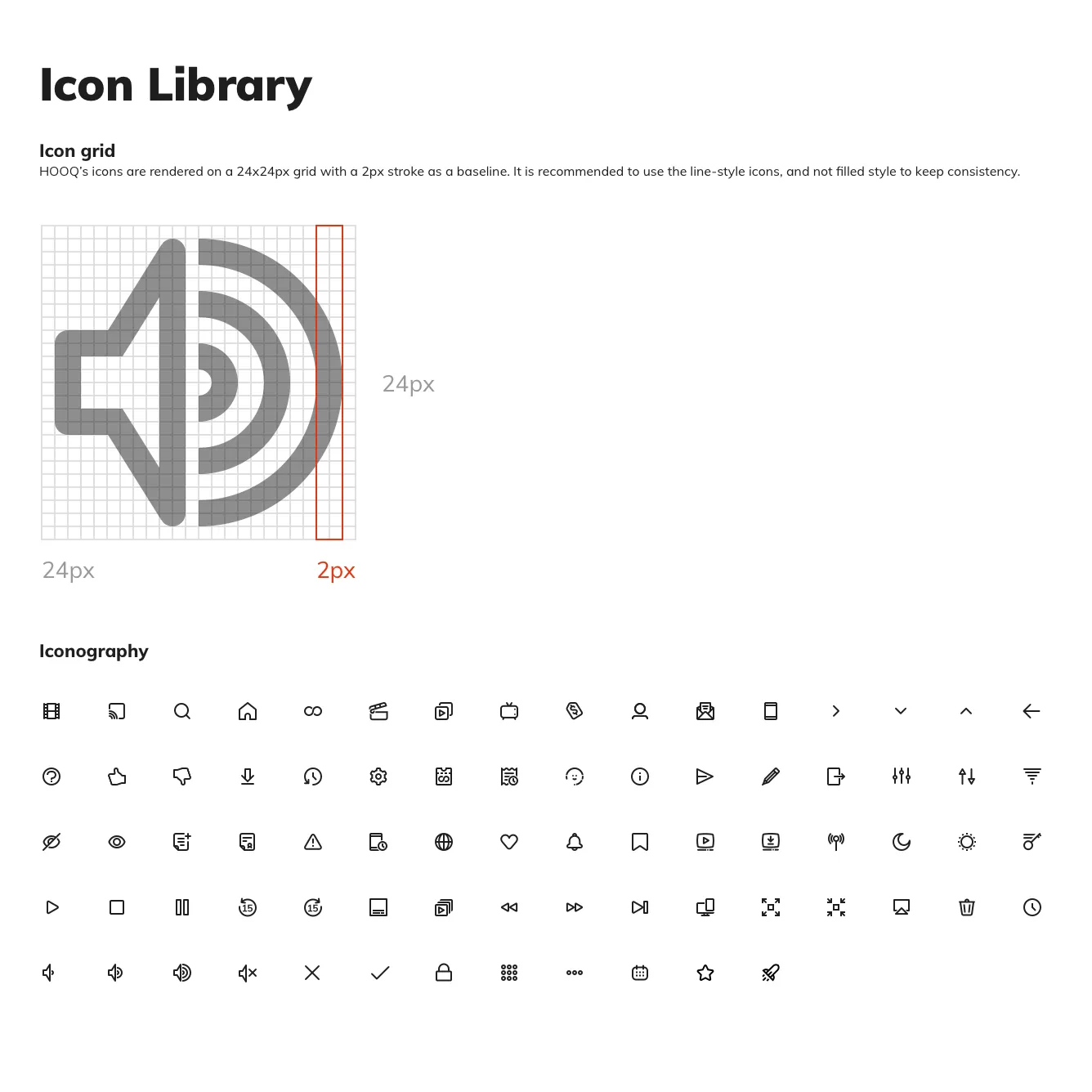
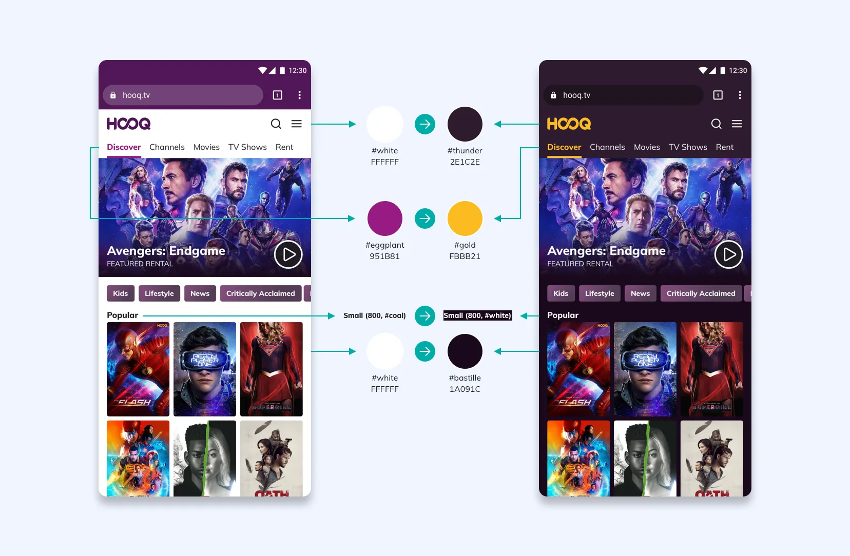
One important consideration was supporting both light and dark themes. I developed corresponding colour swatch pairs to ensure visual consistency, accessibility, and a cohesive experience across both themes, regardless of user preference.
UI patterns
Spotlights
Spotlights are the full width banners that feature the latest/popular content.

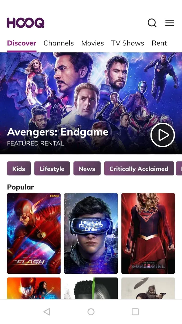
Customers felt the massive spotlights occupied too much space. We had no infrastructure to implement personalisation yet and spotlights were curated manually. If a massive spotlight doesn’t interest customers, it would make the rest of the catalog more inaccessible.
We implemented a conservative spotlight for MVP instead so we could highlight the breadth of the catalog better at the initial view.
Collections
Used to curate a group of titles into one genre or theme.
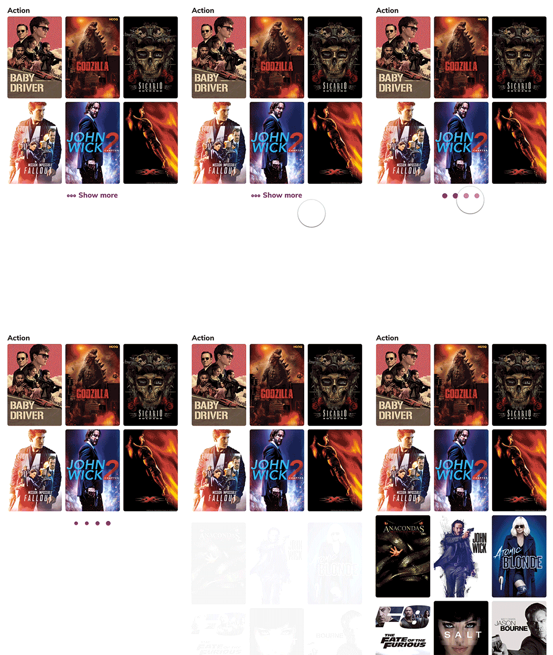
We decided to implement expandable rails since we got more conclusive signals from tracking explicit “Show more” clicks than horizontal scroll events.
Title Details
We explored quick view window components that allow customers to see details without having to leave the main “Discover” feed.
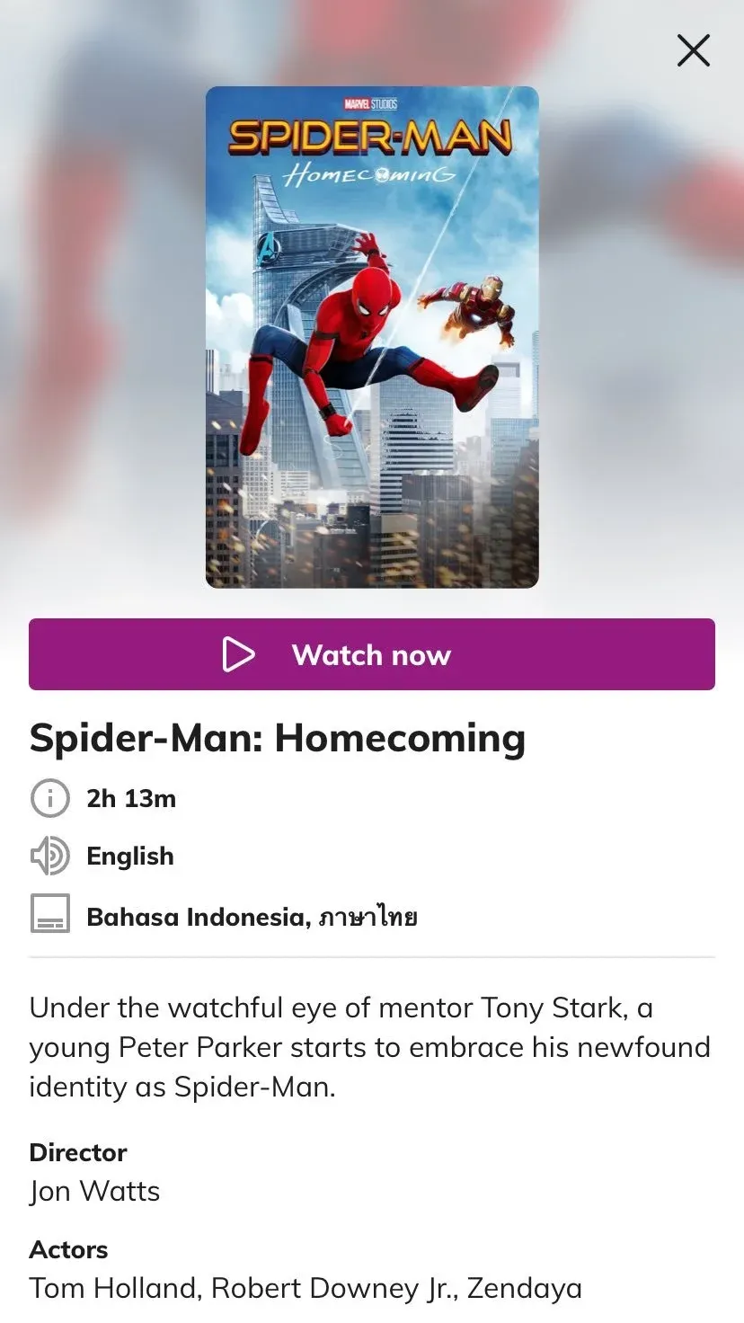
We decided not to pursue the quick view, as research did not provide conclusive evidence of its value relative to the implementation effort. Any potential benefits were expected to be marginal and did not justify the added complexity.
States
We also designed microinteractions to provide clear feedback and set user expectations during data-loading moments throughout the web app.
Screen flows
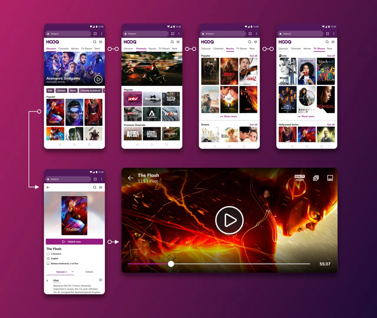
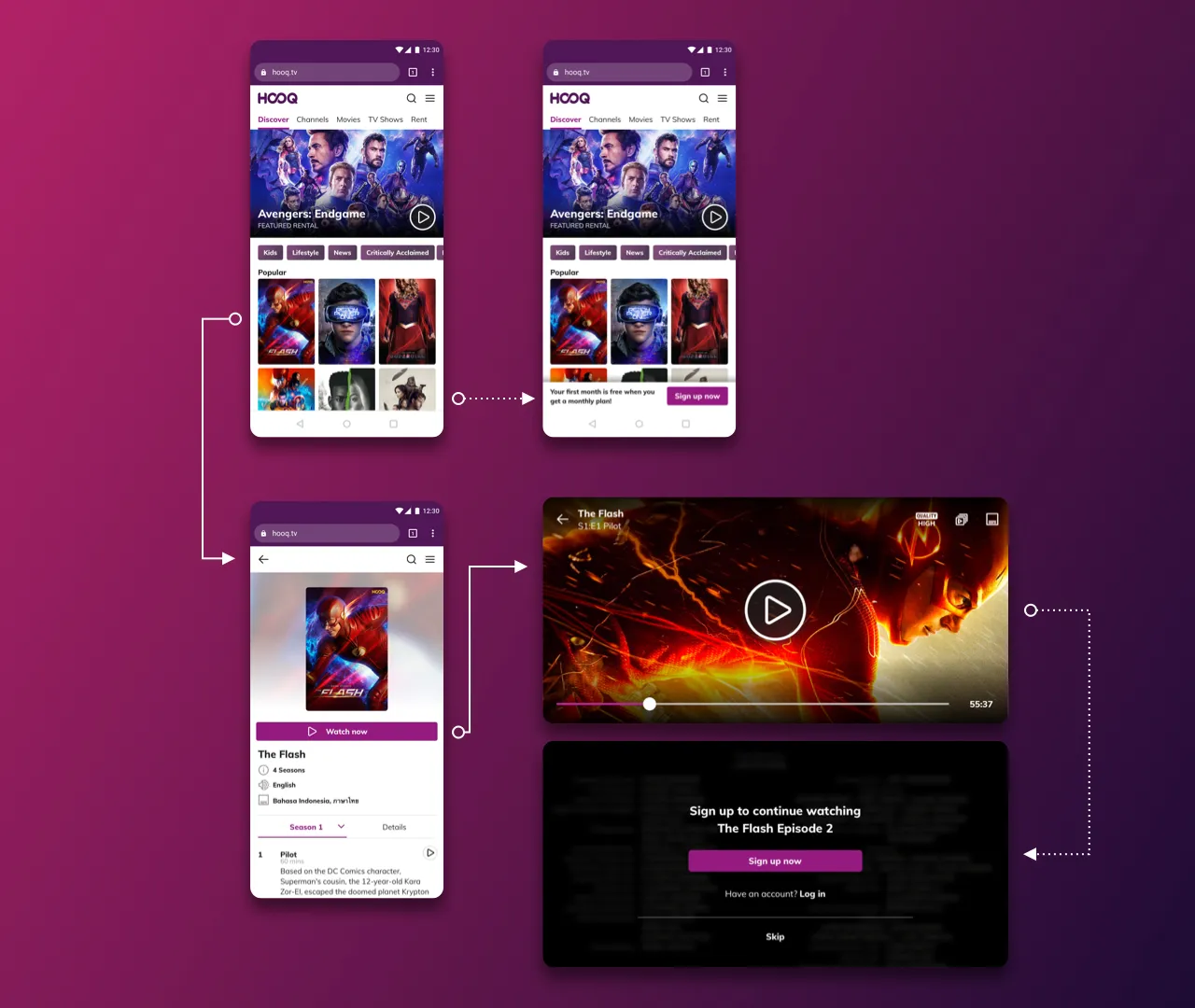
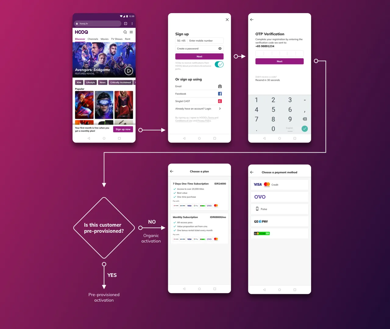
We focused on three core principles to make the PWA experience accessible, intuitive, and flexible. Users could explore the content catalog without signing in, encounter sign-up prompts at relevant moments without interrupting their browsing, and activate their subscriptions through a streamlined flow regardless of whether they came through a telco partnership or organic acquisition.
Open Catalog
Let users explore the content catalog without requiring an account or sign-in upfront.
Contextual Calls to Action
Introduce non-intrusive sign-up prompts at relevant moments, allowing users to engage with content before committing.
Scalable Activation
Support a consistent activation experience for both pre-provisioned telco subscribers and organic users signing up directly.
Outcomes
What went well?
- Pre-provisioned activations on web surpassed iOS by ~7%
- Organic activations were now happening on mobile web
- Users were actually watching videos on PWA
What didn’t go so well?
- There were some missing partnership integrations that prevented us from redirecting traffic to PWA for activation
- Identifying which content was free to watch as an anonymous user was challenging due to licensing
Retrospective
What I’d change if I could do it again?
Enable experimentation
We could have included better frameworks for A/B testing. That would have been the next step after launching 0 to 1.
Cross-platform influence of Design System
Building the Design System could have been scaled to native mobile platforms and TV applications. The Design team refactored components visually but they were still fragmented across platforms in code.